GoXam Concepts and Features
Collapsing and Expanding Trees
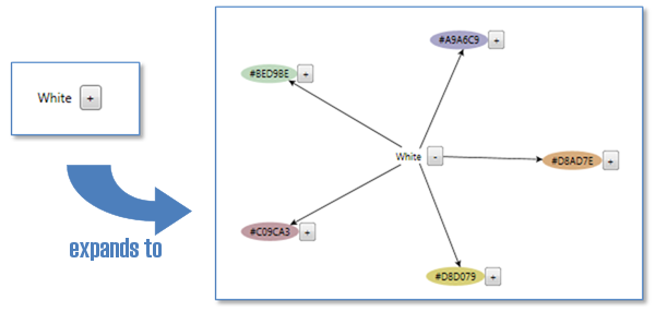
A common technique for large graphs is to allow the user to control the visibility of parts of that tree. Expanding and collapsing subtrees is built into GoXam, as shown in this example where a button is bound to the IsExpandedTree property:

Layers
Graphical objects can be placed within layers to define their Z-order. A DiagramPanel has 9 layers by default, including layers for background, default and foreground nodes and links, as well as layers for input tools and adornments such as selection handles.
Palette Control
Many diagram applications use a palette to support drag and drop of new elements to the view. GoXam also provides a specialized kind of diagram called the Palette. It displays a number of nodes in a rectangular grid-like arrangement. You can use different DataTemplates than in your regular Diagram, in order to provide a smaller or simpler appearance for each item.
Overview Control
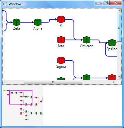
Sometimes graphs are so large that you can only see a portion of them at a reasonable zoom level. For such applications, we provide the Overview control. It displays a thumbnail of the whole model shown by another Diagram and shows that diagram's viewport. The user can click or drag in the Overview to scroll the other diagram's viewport.

Subgraphs / Groups
Many graph types, such as workflow or Business Process Modeling Notation (BPMN), use grouping techniques to organize diagrams. Groups are supported within GoXam, including support for data binding for the definition of the hierarchy and in DataTemplates that define the group's appearance.

Default Group DataTemplate

Group defined by DataTemplate XAML
and subgraphs can expand / collapse too:

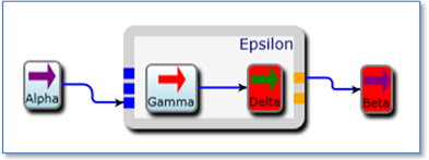
Links from outside the subgraph can connect to a node within the subgraph, to the edge of the subgraph, or to specific ports on the edge of the subgraph border:

Subgraph with input and output ports
Miscellaneous Features
Cut / Copy / Paste / Undo / Redo
Standard clipboard actions are enabled by default, but may be disabled for applications where it isn't desired. To support unlimited and customizable undo and redo, the UndoManager tracks changes to the diagram's model. Changes are logically grouped together by transactions.
Zooming / Scrolling / Panning / Selection
GoXam supports scrolling around and zooming into the diagram. You can scroll and zoom in or out programmatically by setting DiagramPanel properties. The user can scroll using the scrollbars or the PanningTool, and the user can zoom in or out using Control-Mouse-Wheel. GoXam controls support selection, and they make it easy to data-bind to the currently selected node. You can customize selection handles and tool handles (e.g. for resizing) by supplying custom data templates. In-place text editing of any text in the diagram is supported. Just click on any text that is enabled for text editing.
Predefined Shapes and Arrowheads
GoXam comes with over 195+ common shapes predefined for use in common node definitions. The Node Figures sample shows all of these shapes.
The Arrowheads sample shows the 65 predefined arrowhead designs.
XML Save/Restore
GoXam does not require any particular format or medium for storing diagrams. In many cases the application already has its own database schema or binary file format or whatever, so a good Control should not impose any storage requirements.
However, if you don't mind using XML as the document format, and if you don't have any particular XML schema to which you must adhere, and if you use our predefined model data classes, we do make it easy to save and load your model data in XML format. (The Org Chart Editor, State Chart, Logic Circuit and Flow Chart samples all demonstrate the use of XML save/restore.)